
This project required that we use a number of graphic design elements as well as principles using adobe photoshop to display an aesthetically pleasing photo collage.
Abraham Nap's official website
This project required that we use a number of graphic design elements as well as principles using adobe photoshop to display an aesthetically pleasing photo collage.

(I should first and foremost mention that the head of the bird is the ORU logo and is very much not my design. I made this as a potential extension to the existing logo.) Here is a label that I submitted as a part of a design team in my Graphic Design Studio class for the ORU Golf Team. I am much more confident in my traditional illustrative techniques when it comes to somewhat organic forms such as these, so I hand drew the label, using the Fibonacci sequence as my guide for uniformity, and finished the label on the computer. My solution wasn’t chosen by the clients, and we expounded on one of my colleague’s.


These are all the different versions of the pages I gave to the client. He wanted as many things as possible on a double sided piece of paper that was to be handed out to the people attending the Tulsa State Fair. I made all the Illustrations personally and scanned them in. He ended up choosing the last two pages.

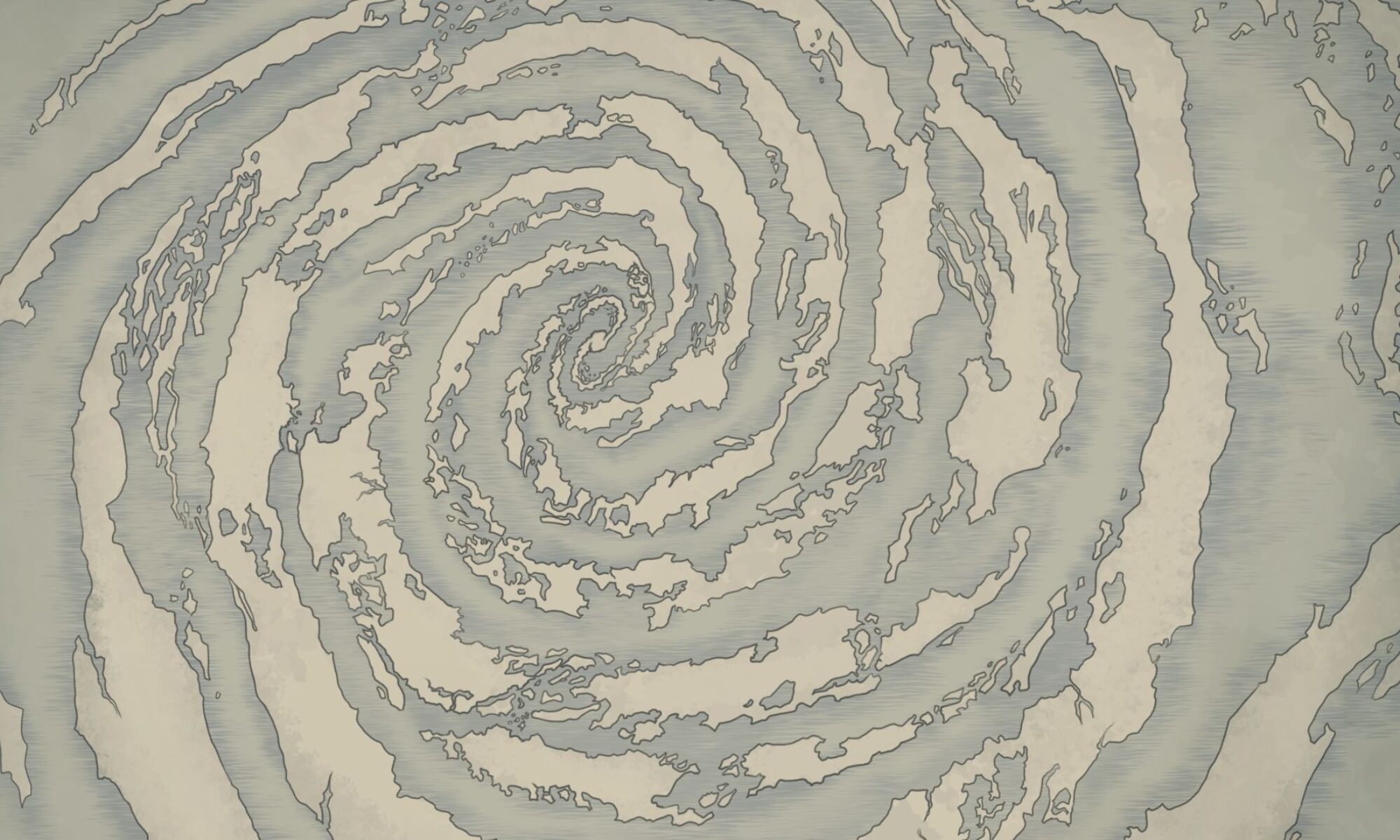
Here is a study I did using two opposite meaning words as my subject matter. I used the two words, “Implode,” and, “Explode”.


Here is a layout I designed for a potential cook book. I used two of my favorite dishes growing up. The solution was not fully realized as I didn’t ever get full access to the images I got from Envato Elements.


Here is a social media campaign I made as a project for class (not posted or used in association with the Tulsa Oklahoma Aquarium). I made a potential snapchat filter on the right, and above, I illustrated a plethora of aquatic life all present in the aquarium in question and made a way to distort them using Adobe After Effects. I uploaded the three separate videos as slides on Instagram to test them out.


Here I was tasked with the creation and assembly of a book cover. I used text from a well known classic book I got from project Gutenberg for this assignment. Using rubber cement, I assembled the printed paper to a scrap book to test the solution.


Here I was tasked with the creation and assembly of a magazine. Using primarily Indesign, I created a layout of images and text I found from public documentations and articles from NASA about one of my personally favorite pieces of celestial beauty known as the Pillars of Creation. I printed the pages in the proper sequence and assembled them using a saddled-stitch.
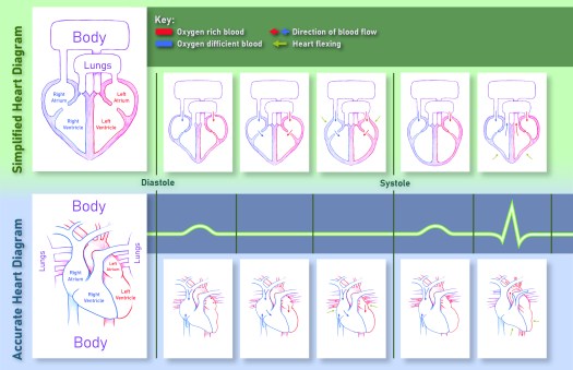
Here a medical infographic I illustrated and designed using my research of the cardiac cycle as my subject matter. I was able to make, what I believe to be, an easily understandable picture for any viewer.


Here is a label a designed for a client for a up-and-coming local Tulsa business. There is a conglomeration of many different subject matters and symbologies that the client wanted present in his brand that I put forth in my product. I offered him any different variations as seen above with eight different possible front sides and six different possible back sides. The enlarged set seen below is the client’s chosen permutation.