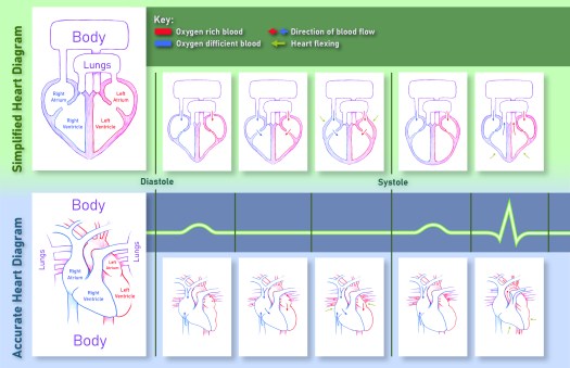
Here a medical infographic I illustrated and designed using my research of the cardiac cycle as my subject matter. I was able to make, what I believe to be, an easily understandable picture for any viewer.
Abraham Nap's official website
Here a medical infographic I illustrated and designed using my research of the cardiac cycle as my subject matter. I was able to make, what I believe to be, an easily understandable picture for any viewer.


Here is a poster that I submitted as a part of a design team in my Graphic Design Studio class for the ORU Theater’s: The Tempest play. My solution wasn’t chosen by the client, and we expounded on one of my colleague’s solutions, refining it, and using it for other purposes such as social media advertising, programs, and digital signage posters for televisions across ORU campus.


Here is a label a designed for a client for a up-and-coming local Tulsa business. There is a conglomeration of many different subject matters and symbologies that the client wanted present in his brand that I put forth in my product. I offered him any different variations as seen above with eight different possible front sides and six different possible back sides. The enlarged set seen below is the client’s chosen permutation.

This is a logo I made for a local business: Fence Co. It was not in association with the business however, as this was a logo a made for class. We were tasked with making many different logos, understanding the brand and extrapolating the brand identity through design principles and creating numerous variations for any potential purposes or environments the logo could be used in.


Here’s one of my first websites where I created many separate pages with mock buttons and functions.

Here is a menu website I made for the local business, though not in association with them.


Here is a website I made as a part of my paper on Bidoni and Didone typefaces.


Here’s a showcase of my wireframing process for my websites.

In this project, I was tasked with making a dynamic T-shirt design with the parameters of only using three colors and conceptualizing said design after a certain organization within the ORU campus. I tried using light and warm colors to convey a cozy atmosphere and incorporated visuals corresponding to what I think embodies the life of a commuting student.